Showing posts with label plotting. Show all posts

Saturday, March 11, 2023

Casio fx-CG50: Plotting the Betting Equation

Casio fx-CG50:  Plotting the Betting Equation


Introduction


The program BETPLOT plots two equations:


The betting equation, based on logistic equation:


y1(x) = p(x) = 1 / (1 + α*x^β)


α, β:  parameters

x:  data point, odds given by the booker

p(x):  probability, probability that a favorite event happens/wins


The expected profit equation:


y2(x) = p(x) * x - (1 - p(x))


Casio fx-CG 50 Program:  BETPLOT


The characters α, β, and # are found in the CHAR sub menu (outside of the PRGM menu).  If you have a monochrome calculator or just don't want color, ignore the color commands.


The program then graphs the resulting equation.   The variables Y1 and Y2 (with the bold Y) represent functions of X.  


"BETTING EQN."

"DAVID SUMPTER"

Red "1÷(1+αX^β)"◢

"INCREMENT"?→1

"# STEPS"?→S

"α"?→A

"β"?→B

"(1+A×X^B)^-1"→Y1

"X×Y1-(1-Y1)"→Y2

Y=type

SetG-Color Black, 1

SetG-Color Green, 2

Seq(K,K,0,S×I+I,I)→List 1

(1+A×List 1^B)^-1→List 2

List 2×List1-(1-List 2)→List 3

ClrText

"COL. 1: X"

"COL. 2: P(X)"

"COL. 3: EXP. WIN"◢

List→Mat(List 1,List 2,List 3)◢ 

ViewWindow 0,S×I,I,Min(List 2)-1,Max(List 2),0.25

AxesOn

GridOn

DrawGraph


Examples


Example 1:

α = 1.3, β = 1.01


Example 2:

α = 1.16, β = 1.25


Source:


Sumpter, David.  The Ten Equations That Rule the World: And How You Can use Them Too.  Flatiron Books: New York.  2021.  ISBN 978-1-250-24696-7


Eddie


All original content copyright, © 2011-2023.  Edward Shore.   Unauthorized use and/or unauthorized distribution for commercial purposes without express and written permission from the author is strictly prohibited.  This blog entry may be distributed for noncommercial purposes, provided that full credit is given to the author. 


Friday, September 9, 2022

Casio fx-991EX Classwiz Tips: Tables and Graphs

Casio fx-991EX Classwiz Tips:  Tables and Graphs


This week I am going to show some things that can be done with the Casio fx-991EX Classwiz.  


Believe it or not, the Classwiz can produce graphs of functions.   But not in the way we are used to.  


Generating Tables and Graphs


To generate a table, press [ MENU ], 9: Table.  The Classwiz will always ask for two functions f(x) and g(x).  The function g(x) can be left blank.


You are asked for:

Start:  minimum x value

End:  maximum x value

Step:  change of x


number of steps =  ceiling((End - Start) / Step)


The maximum number of steps for f(x) alone is 45, it gets reduced to 30 if both f(x) and g(x) are used. 


The table of values are displayed.


While the table is displayed, you can generate a graph by pressing [SHIFT] (QR).  This has the Classwiz generating a QR code.  You will need a QR reader, which you can use the Casio EDU app to read the code.


Once the QR code fits into the camera, you are given a link.  Below are examples of graphs:


I hope this week has been helpful in highlighting some of the features of the Casio Classwiz.   For the students in school, I wish you a happy and successful school year.


The next blog post will be on September 15, 2022.   Also, I am going to talk about HHC 2022 in Nashville.  


Eddie


All original content copyright, © 2011-2022.  Edward Shore.   Unauthorized use and/or unauthorized distribution for commercial purposes without express and written permission from the author is strictly prohibited.  This blog entry may be distributed for noncommercial purposes, provided that full credit is given to the author. 


Saturday, January 30, 2021

TI-Nspire Python: Linear Regression

 TI-Nspire Python:  Linear Regression


Introduction


The following is a simple script to fit bivariate data using linear regression:


y = ax + b


a = slope

b = y-intercept


Download the document here:  https://drive.google.com/file/d/1trsa6oLdb0SG-1cHzog1stcbE6XY6BTv/view?usp=sharing


TI-Nspire Python Script:  linreg.py


# 2020-12-31 EWS

# linear regression 

from math import *


# enter and calculate data

xlist=[]

ylist=[]

n=int(input('n? '))

nb=0

sx=0

sx2=0

sy=0

sy2=0

sxy=0


for i in range(n):

  nb=nb+1

  print("Data Point "+str(nb))

  x=float(input('x? '))

  y=float(input('y? '))

  sx=sx+x

  sy=sy+y

  sx2=sx2+x**2

  sy2=sy2+y**2

  sxy=sxy+x*y

  xlist.append(x)

  ylist.append(y)


# slope

a=(sxy-sx*sy/nb)/(sx2-sx**2/nb)

# y-intercept

b=sy/nb-a*sx/nb

# correlation

r=(sxy-sx*sy/nb)/(sqrt(sx2-sx**2/nb)*sqrt(sy2-sy**2/nb))


# results

print("y = ax + b")

print("a= "+str(a))

print("b= "+str(b))

print("r= "+str(r))


The following script adds a plot of both the real and predicted data.


TI-Nspire Python Script:  linregplus.py


# 2020-12-31 EWS

# linear regression with plot

from math import *

import ti_plotlib as plt


# enter and calculate data

xlist=[]

ylist=[]

n=int(input('n? '))

nb=0

sx=0

sx2=0

sy=0

sy2=0

sxy=0


for i in range(n):

  nb=nb+1

  print("Data Point "+str(nb))

  x=float(input('x? '))

  y=float(input('y? '))

  sx=sx+x

  sy=sy+y

  sx2=sx2+x**2

  sy2=sy2+y**2

  sxy=sxy+x*y

  xlist.append(x)

  ylist.append(y)


# slope

a=(sxy-sx*sy/nb)/(sx2-sx**2/nb)

# y-intercept

b=sy/nb-a*sx/nb

# correlation

r=(sxy-sx*sy/nb)/(sqrt(sx2-sx**2/nb)*sqrt(sy2-sy**2/nb))


# results

print("y = ax + b")

print("a= "+str(a))

print("b= "+str(b))

print("r= "+str(r))


# predictive list

plist=[]

for i in range(n):

  p=a*xlist[i]+b

  plist.append(p)


# plot routine

# clear the screen

plt.cls()

# automatically fits the screen to fit the data

plt.auto_window(xlist,ylist)

# display the axes

# "on" plots axes and endpoints

# "axes" just plots the axes

plt.axes("on")


# select color - use RGB style

# denim blue, real data

plt.color(21,96,189)

plt.plot(xlist,ylist,".")

# orange, predictive data

plt.color(255,165,0)

plt.plot(xlist,plist,".")

# plot the graph

plt.show_plot()


Eddie


All original content copyright, © 2011-2021.  Edward Shore.   Unauthorized use and/or unauthorized distribution for commercial purposes without express and written permission from the author is strictly prohibited.  This blog entry may be distributed for noncommercial purposes, provided that full credit is given to the author. 


Sunday, January 17, 2021

TI-Nspire: Templates to Plot Functions, Parametric Equations, and Sequences

 TI-Nspire:  Templates to Plot Functions, Parametric Equations, and Sequences


Introduction


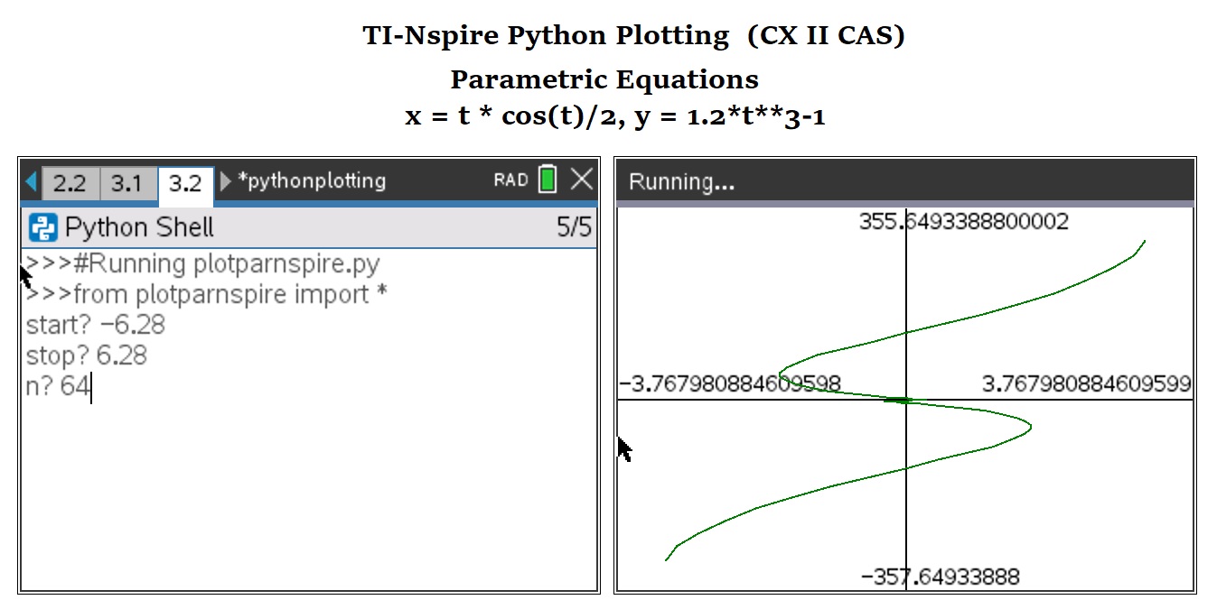
The following are sample templates to plot functions in the form of y=f(x), parametric equations (x(t), y(t)), and one-level deep recurrence relations.


I used a while loop instead of a for loop because I tend to always use for loops, and working with integer objects can be quite difficult for non-Python experts like me.  


The equations will be defined inside the script instead of having the user enter the script.  .   I am using the TI-NSpire CX II software 5.2.0771.  I have programmed this with the TI-Nspire CX CAS software, but it should work on the non-CAS version.  


As far as entering numbers at the input prompt, I have to enter approximations for π (which is approximately 3.1415926535).  


The list.append(value) or list.append(list) adds the elements to the end of the list and the list is automatically saved.  


The graphic commands uses a TI-specific module ti_plotlib.  I have a lot of pleasure working with this module, with commands for clearing the graphic screen, automatically sizing the window, plotting the axes, with or without the numeric numeric endpoints, and set a color with RGB codes (any color you want).  


You can download the file here:  https://drive.google.com/file/d/1k_3lTVK5KK1ACXrVxemSWz_g-l8Nn62A/view?usp=sharing


The text of the scripts are presented below.


Plotting Functions -   TI-Nspire CX II (CAS) Script:  plotfxnspire.py


from math import *

import ti_plotlib as plt


# EWS 2020-12-28


# define function here

def f(x):

  y=1/(x**2+1)

  return y


# main routine

xa=float(input('start? '))

xb=float(input('stop? '))

n=float(input('n? '))

xc=(xb-xa)/n


# build

xp=xa

yp=f(xp)

xlist=[xp]

ylist=[yp]


while xp<xb:

  xp=xp+xc

  yp=f(xp)

  xlist.append(xp)

  ylist.append(yp)


# plot routine

# clear the screen

plt.cls()

# automatically fits the screen to fit the data

plt.auto_window(xlist,ylist)

# display the axes

# "on" plots axes and endpoints

# "axes" just plots the axes

plt.axes("on")


# select color - use RGB style

# denim blue

plt.color(21,96,189)


# plot the graph

plt.plot(xlist,ylist,".")

plt.show_plot()


Plotting Parametric Equations -   TI-Nspire CX II (CAS) Script:  plotparnspire.py


from math import *

import ti_plotlib as plt


# EWS 2020-12-28


# define parametric here

def x(t):

  x=t*cos(t)/2

  return x

def y(t):

  y=1.2*t**3-1

  return y


# main routine

ta=float(input('start? '))

tb=float(input('stop? '))

n=float(input('n? '))

tc=(tb-ta)/n


# build

tp=ta

xp=x(tp)

yp=y(tp)

xlist=[xp]

ylist=[yp]


while tp<tb:

  tp=tp+tc

  xp=x(tp)

  yp=y(tp)

  xlist.append(xp)

  ylist.append(yp)


# plot routine

# clear the screen

plt.cls()

# automatically fits the screen to fit the data

plt.auto_window(xlist,ylist)

# display the axes

# "on" plots axes and endpoints

# "axes" just plots the axes

plt.axes("on")


# select color - use RGB style

# mid green

plt.color(0,128,0)


# plot the graph

plt.plot(xlist,ylist,".")

plt.show_plot()


Plotting a Recurrence Relation-   TI-Nspire CX II (CAS) Script:  plotseqnspire.py


Use u for u_n-1.  You should also be able to include n without problems.  


from math import *

import ti_plotlib as plt


# EWS 2020-12-28


# define sequence here, u for u(n-1)

def w(u):

  w=cos(u)+1

  return w


# main routine

ui=float(input('initial? '))

n=float(input('n? '))


# build

xlist=[0]

ylist=[ui]

k=0


while k<n:

  k=k+1

  f=w(k)

  xp=k

  yp=f

  xlist.append(xp)

  ylist.append(yp)


# plot routine

# clear the screen

plt.cls()

# automatically fits the screen to fit the data

plt.auto_window(xlist,ylist)

# display the axes

# "on" plots axes and endpoints

# "axes" just plots the axes

plt.axes("on")


# select color - use RGB style

# orange

plt.color(255,127,39)


# plot the graph

plt.plot(xlist,ylist,".")

plt.show_plot()


Eddie


All original content copyright, © 2011-2021.  Edward Shore.   Unauthorized use and/or unauthorized distribution for commercial purposes without express and written permission from the author is strictly prohibited.  This blog entry may be distributed for noncommercial purposes, provided that full credit is given to the author. 


Saturday, January 16, 2021

Numworks: Templates to Plot Functions, Parametric Equations, and Sequences

 Numworks:  Templates to Plot Functions, Parametric Equations, and Sequences


Introduction


The following are sample templates to plot functions in the form of y=f(x), parametric equations (x(t), y(t)), and one-level deep recurrence relations.


I used a while loop instead of a for loop because I tend to always use for loops, and working with integer objects can be quite difficult for non-Python experts like me.  


The equations will be defined inside the script instead of having the user enter the script.  If anyone knows how to use input to enter functions, please let me know.   I am using Numworks software version 14.4.  


As far as entering numbers at the input prompt, I have to enter approximations for π (which is approximately 3.1415926535).  The plot screen is made to fit the y-minimum and y-maximum values within the window.


The list.append(value) or list.append(list) adds the elements to the end of the list and the list is automatically saved.  


The named colors, which is required in matplolib.pyplot, available are:  'black', 'blue', 'brown', 'green', 'grey', 'orange', 'pink', 'purple', 'red', 'white', and 'yellow'.


Plotting Functions -   Numworks Script:  plotfunction.py


from math import *

from matplotlib.pyplot import *

# EWS 2020-12-26


# define function here

def f(x):

  y=1/(x**2+1)

  return y


# main routine

xa=float(input('start? '))

xb=float(input('stop? '))

n=float(input('n? '))

xc=(xb-xa)/n


# build

xp=xa

yp=f(xp)

xlist=[xp]

ylist=[yp]


while xp<xb:

  xp=xp+xc

  yp=f(xp)

  xlist.append(xp)

  ylist.append(yp)


# plot routine


# set axes

ya=min(ylist)

yb=max(ylist)

axis((xa,xb,ya,yb))

axis(True)

grid(True)


# select color, type color

ch="blue"


# plot points

plot(xlist,ylist,color=ch)

show()


Plotting Parametric Equations -   Numworks Script:  plotparametric.py


from math import *

from matplotlib.pyplot import *

# EWS 2020-12-26


# define parametric here

def x(t):

  x=t**2-3*t+1

  return x

def y(t):

  y=abs(2*sin(t))

  return y


# main routine

ta=float(input('start? '))

tb=float(input('stop? '))

n=float(input('n? '))

tc=(tb-ta)/n


# build

tp=ta

xp=x(tp)

yp=y(tp)

xlist=[xp]

ylist=[yp]


while tp<tb:

  tp=tp+tc

  xp=x(tp)

  yp=y(tp)

  xlist.append(xp)

  ylist.append(yp)


# plot routine


# set axes

xa=min(xlist)

xb=max(xlist)

ya=min(ylist)

yb=max(ylist)

axis((xa,xb,ya,yb))

axis(True)


# select color, type color

ch="red"


# plot points

plot(xlist,ylist,color=ch)

show()


Plotting a Recurrence Relation-   Numworks Script:  plotsequence.py


Use u for u_n-1.  You should also be able to include n without problems.  


from math import *

from matplotlib.pyplot import *

# EWS 2020-12-26


# define parametric here

# u: u(n-1)

def w(u):

  f=sqrt(3*u+1)

  return f


# main routine

ui=float(input('initial? '))

n=float(input('n? '))


# build

xlist=[0]

ylist=[ui]

k=0


while k<n:

  k=k+1

  f=w(k)

  xp=k

  yp=f

  xlist.append(xp)

  ylist.append(yp)


# plot routine


# set axes

ya=min(ylist)

yb=max(ylist)

axis((0,n,ya,yb))

axis(True)


# select color, type color

ch="green"


# plot points

plot(xlist,ylist,color=ch)

show()


On tomorrow's blog, January 17, 2021, I am going to present these scripts for the TI-Nspire CX II.   I used the CX CAS software, but this should work on the CX (non-CAS) calculator and software as well.  

Eddie


All original content copyright, © 2011-2021.  Edward Shore.   Unauthorized use and/or unauthorized distribution for commercial purposes without express and written permission from the author is strictly prohibited.  This blog entry may be distributed for noncommercial purposes, provided that full credit is given to the author. 


Tuesday, February 6, 2018

HP Prime: Pixel Plot, How to Change Cartesian Coordinates to Pixels

HP Prime: Pixel Plot, How to Change Cartesian Coordinates to Pixels


Changing Cartesian Coordinates to Pixels

When running programs on the HP Prime, the screen has a pixel coordinate system of 320 x 220 (to allow room for soft menu keys). 


There are two ways to calculate to translate Cartesian coordinates to pixel coordinates on the HP Prime.  The easy way is to use the CPX command. 

However, if you are working in custom made apps, CPX may not work because the command requires that app has the Plot variables Xmin, Xmax, Ymin, and Ymax.  This will require a conversion formula.

Given a desired xmin, xmax, ymin, and ymax, the following formulas I use are:

Scaling: 
xs = (xmax – xmin)/320
ys = (ymax – ymin)/-220 = (ymin – ymax)/220

Conversion to pixels of coordinates (x,y):
xp = (x – xmin)/xs
yp = (y – ymax)/ys

HP Prime Program: PIXELPLOT

EXPORT PIXELPLOT()
BEGIN
// EWS 2014-02-04

LOCAL xm,ym,xp,yp,x,y;
LOCAL xn,yn,xs,ys;
LOCAL ya,ch,flag;
LOCAL fx;

// set color scheme
LOCAL col1,col2;
col1:={#BF00FFh,#7DF9FFh,
#00FF00h,#D4AF37h,#FF0000h};
col2:={#4B0082h,#000080h,
#228B22h,#C3B091h,#800000h};

// Radians
HAngle:=0;

INPUT({{fx,[2]},
xm,xn,ym,yn,
{ch,
{"Purple","Blue","Green",
"Gold","Red"}}},
"Pixel Plot Official",
{"f(x) string:",
"x-min: ","x-max: ",
"y-min: ","y-max: ",
"Color: "});

RECT_P(0);

// calulate the scale
xs:=(xn-xm)/320;
ys:=(yn-ym)/−220;

// drawing

// color choice
LOCAL c1,c2;
c1:=col1[ch];
c2:=col2[ch];

// axis information
LOCAL st1,st2;
st1:="x:["+xm+","+xn+"]";
st2:="y:["+ym+","+yn+"]";
TEXTOUT_P(st1,0,0,2,#C0C0C0h);
TEXTOUT_P(st2,0,20,2,#C0C0C0h);

// function
FOR x FROM xm TO xn STEP xs DO

// skip 0 for now
IF x==0 THEN
CONTINUE;
END;

// function
y:=EXPR(fx);

// point→pixel, plot
// only if y is real
IF TYPE(y)==0 THEN
xp:=(x-xm)/xs;
yp:=(y-yn)/ys;
PIXON_P(xp,yp,c1);
END;

END;

// freeze screen
FREEZE;

END;

Notes: 

1. You should not have to include the string characters for f(x) as they are included in the input.

2. Use the lowercase x.

3. The program errors if a plot reaches point where f(x) is not defined.  I put in a condition when f(x) is complex (for example, the square root of negative number) for the plot to skip that pixel.  However, I have not put error skipping conditions when it comes to ln(x) or 1/p(x) where p(x) is a polynomial.  However, the pixel at x=0 is skipped to hopefully alieve some problems.  Be sure your range is appropriate.

4. The program uses Radians angle mode (HAngle = 0).

5.  I chose to have a black background with five color options (purple, electric blue, green, gold, and red) just for fun. 

Examples

Example 1:  f(x) = 2.5*cos(x^2)


Example 2:  f(x) = √(x^2 – 6)


Example 3:  f(x) = e^(-x^2)


Eddie

This blog is property of Edward Shore, 2018.

Thursday, October 12, 2017

Adventures in Python: Plotting Sine and Cosine, The numpy Module

Adventures in Python:  Plotting Sine and Cosine, The numpy Module

This program will require that you have both numpy and matplotlib.  If you are working with Pythonista for the iOS, the two modules are included.  Other versions of Python require that you download matplotlib and numpy separately. 


Pointers:

1. The module numpy works with functions with lists as arguments.  There is a math function associated with numpy.  See the section on numpy functions below.

2.  It is helpful to set up all the graphing parameters before showing the graph with pylplot.show().

3. Color strings are six digit hexadecimal integers with the format ‘#RRGGBB’ (R = red, G = green, B = blue)

4.  To turn the plot grid on, use pyplot.legend().  To turn on the legend on use pyplot.legend().  Labels are defined in pyplot.plot


Program:

# this will require matplotlib
# download if needed

# radians mode is the default
import matplotlib
from matplotlib import pyplot

# will need numpy to generate lists
import numpy

# we will need math module for pi
import math

# generate lists
x = numpy.linspace(-2*math.pi, 2*math.pi, 50)
# sin and cos are included in numpy
y1 = numpy.sin(x)
y2 = numpy.cos(x)
y3 = numpy.sin(x)+numpy.cos(x)
# alt for y3: numpy.add(y1,y2)


# the plot begins
pyplot.plot(x,y1,color = '#228b22', label = 'sin x')
pyplot.plot(x,y2,color = '#ffa500', label = 'cos x')
pyplot.plot(x,y3,color = '#919811', label = 'sin x + cos x')


# turn grid on
pyplot.grid(True)
# labels
pyplot.title('Trig Plots 007')
pyplot.xlabel('x')
pyplot.ylabel('y')
# turn legend box on
pyplot.legend()
# show the plot
pyplot.show()

Output:


Some Numpy Functions

numpy.add(list 1, list 2)    Adds two lists, element by element.

numpy.subtract(list 1, list 2)   Subtracts list 2 from list 1, element by element.

numpy.mutiply(list 1, list 2)   Multiplies two lists, element by element.

numpy.divide(list 1, list 2)    Divides list 1 by list 2, element by element.

numpy.power(list 1, list 2)    Calculates list 1**list 2.

numpy.maximum(list 1, list 2)  Takes the maximum of each respective pair.

numpy.minimum(list 1, list 2)   Takes the minimum of each respective pair.

numpy.round(list, number of decimal places)  Round each element.

Other element by element operations: (one list arguments – Radians is the default angle measure)

numpy.square
numpy.sqrt
numpy.cbrt (cube root)
numpy.absolute
numpy.sin
numpy.cos
numpy.tan
numpy.radians (convert to radians)
numpy.asin
numpy.acos
numpy.atan
numpy.degrees (covert to degrees)
numpy.exp
numpy.log (ln)
numpy.real
numpy.imag
numpy.angle
numpy.log10 (log)
numpy.sinc
numpy.i0 (Bessel first kind, order 0)

Until next time,

Eddie


This blog is property of Edward Shore, 2017.

Sunday, May 1, 2016

HP Prime: The Basics of Graphing (Function App)

HP Prime: The Basics of Graphing (Function App)


Over the last few days, I have seen requests for a tutorial of how to graph functions.  I myself received a request to do one.  

This tutorial assumes that are using the most updated version of the HP Prime.   Be aware there has not been an update on the iOS version yet (last version is 9069 as of 5/1/2016). 

7/27/2016 Update:   Sadly, version 10077 has been pulled due to issues and HP decided to take it off out of caution.  The latest firmware is back to 8151.  :(  Affected areas will be deleted.  Apologizes for any inconvenience.  (yes, this sucks)


We are going to work with the Function App.  Let’s get started.

The Three Main App Keys


[Symb]:  The Symb screen is where you enter up to ten functions, which are defined F1 to F9, then F0. 

[Shift] [Symb]:  You can change the angle measure, number format, and complex number format to be specific to the Function App.  I usually just leave all three set at System (to borrow from System settings from Home Settings)

[Plot]:  The Plot screen is the graph screen.  You may drag the screen to view different parts of the graph. 

[Shift] [Plot]:  This is where you set up the plot screen, where you set the screen’s horizontal boundaries (X Rng), the screen’s vertical boundaries (Y Rng), the tick marks (X Tick, Y Tick).  Scrolling down to page 2, you can turn on or off Axes, Labels, grid dots, and grid lines.  You have other options such as cursor and method options.  With the 10077 firmware, you can set the background if desired. 

For this tutorial, I will have the background turned off.

[Num]:   This will display a numerical table.  (X, F1, F2,…). 

[Shift] [Num]:  Set table options


Plotting Functions


Entering Functions on the Symb Screen


(Defining the function F(1)=X^2+3*X-1 and plotting it)


1.  Press the [Symb] screen.  

Note:  If you want to clear all the functions that are defined, press [Shift] [Esc] (Clear) and press the soft key (OK) to the “Clear all expressions?” prompt.

2.  Enter your function.  The independent variable is the capital X.  Press [Enter] or the soft key (OK) when you are done.
3.  To plot the function, press the [Plot] key. 

Note: You can change a function’s color.  To do so, select the color box to the left of the function and press either [Enter] or the (Choose) soft key.  You can then choose from any of the eight pre-selected colors or a custom color (lower-right square on the color palette). 


Setting Easy Graphing Plot Setups

On the Plot screen, you can select pre-programmed plot setups:  Autoscale (my favorite), Decimal, Integer, or Trig. 

For the screen shots below, cleared the functions then defined F1(X) = SIN(X) + COS(X) and set the calculator to Radian mode. 


 You can see the difference below (based on the example, results may vary depending on the functions defined):


Steps:

1.  Press the [View] key. 
2.  Select the desired zoom setup (options 3 – 6).

Using the Plot Setup Screen

You can also use the plot up screen to set up the boundaries.   To do this:

1.  Press [Shift] [Plot]. 
2.  To set the Horizontal edges, select the X Rng row.   The left box is the Xmin (x-minimum, left side) and the right box is Xmax (x-maximum, right side).
3.  To set the Vertical edges, select the Y Rng row.   The left box is the Ymin (y-minimum, bottom side) and the right box is Ymax (y-maximum, top side).
4.  If desired, you can set the tick marks of the grid.  To do this, change the X Tick and Y Tick. 
5.  If desired, you can press the page down soft key to turn axes, grid dotes, grid lines, and labels on or off.  Turning labels on will show the range values on the plot screen.
6.  To see the changes, press the [Plot] key. 

Note:  If you want to reset the graph screen to default settings, press [Shift] [Esc] (Clear).   The default settings are:  Xmin = -15.9, Xmax = 15.9, Ymin = -10.9, Ymax = 10.9, X Tick = 1, and    Y Tick = 1.


Setting the plot window as the following:  Xmin = 0, Xmax = 2*π ≈ 6.28318530718, Ymin = -2, Ymax = 2.


Tracing the Function

When you first graph functions, tracing is turned on automatically.  That is when you press the directional pad left and right, you follow the function.  If there are two or more functions plotted, you can press up or down to select which function you want to trace.

You can also turn off tracing to allow the cursor to roam freely, press the soft key (Menu) to call the menu.  Press the (Trace ) soft key to toggle the trace settings.   Note when the menu isn’t showing, you are seeing the coordinates of the cursor. 

*(Trace*):  Trace with the dot showing, trace is turned on.  The cursor follows functions.  The cursor shows the X and function values.

*(Trace ):   Trace without the dot showing, trace is turned off.  The cursor is in free roaming mode.  The cursor shows the X and Y values.


Center the Plot Screen to Where the Cursor is Located


1.  Move the cursor to wherever want to center the plot screen.  
2.  Press the (Menu) soft key to bring up the menu.   Press the (Zoom) soft key.
3.  Select Center on Cursor.  That is all there is to it.

Zoom Using a Box


Zoom using a box (F1(X) = 2*COS(X) – 1)

Steps:

1.  Plot the function (use the [Plot] key)
2.  Press the (Menu) soft key to bring up the menu.  Press the (Zoom) soft key.
3.  Select Box…   You will be prompted to select on corner of the box.  Press (OK) or [Enter].
4.  Then select the opposite corner.  You will see the area of zoom by a shaded box.  Once you are satisfied, press (OK) or [Enter].
5.  The plot screen is adjusted to the box you selected.

Move the Cursor to a Specific Position


You can send the cursor to a specific position.  This is a useful function if you need to go to a specific place.  All you have to do is press the (Go To) soft key.  You will be prompted for an X coordinate.

If Trace is turned on, the cursor moves to the X coordinate and the function value.  If Trace is turned off, you will be prompted for both the X and Y coordinates.


For information regarding Definition and Transformation, please see my post on the HP Prime 10077:  http://edspi31415.blogspot.com/2016/04/hp-prime-firmware-update-firmware-10077.html


Let’s explore some basic functions that you can operate on the Function app.


The Root of a Function

To find the root (zero of a function):


1.  On the Plot screen, have Trace turned on (see above).  Select your function.
2.  Press the (Fcn) soft menu and select Root. 
3.  The HP Prime finds the root that is closest to the cursor automatically. 


Integrals

To find the area under the curve (numerical integral):

1.  On the Plot screen, have Trace turned on and select your function.
2.  Press the (Fcn) soft menu and select Signed Area.
3.  Enter the lower limit.  You can use the directional pad or enter a specific X value.
4.  Enter the upper limit.  You can use the directional pad or enter a specific Y value.  Any area above the x-axis is shaded in green and area shaded below the y-axis is shaded in red.
5.  Press (OK) or [Enter].  The area is calculated. 

Derivative

1.  On the Plot screen, have Trace turned on (see above).  Select your function.
2.  Press the (Fcn) soft menu and select Slope. 
3.  The HP Prime displays the slope (derivative) automatically.  You can trace the function to display the slope at other points. 

Intersection of Two Functions (or a Function and an Axis)


1.  On the Plot screen, have Trace turned on (see above).  Select your (first) function, and place the cursor close to the intersection as possible.
2.  Press the (Fcn) soft key and select Intersection. You will be prompted to select the second function or an axis.
3.  The intersection should be displayed. 

Note:  Make sure that the cursor is close to the intersection you want.  Otherwise, the function may not return an answer.


This covers some of the basics of the Function App.  There is a lot more to explore of this app.  

Eddie


This blog is property of Edward Shore, 2016.


Python – Earth’s Radius and Gravity in US Units

Python – Earth’s Radius and Gravity in US Units Introduction The following script, gravus2.py, estimates the Earth’s gravity i...